


728x90
반응형
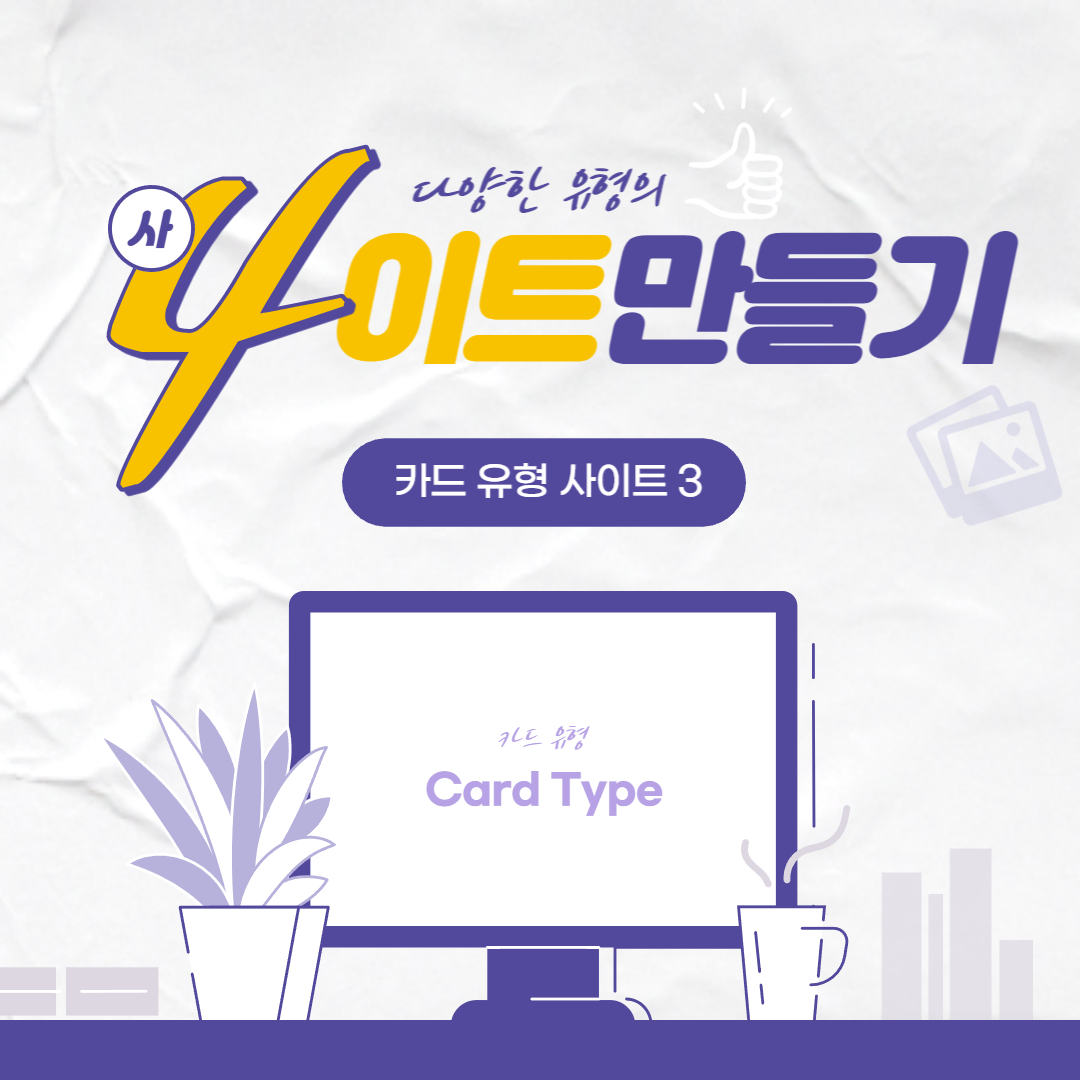
사이트 만들기3
카드 유형의 사이트 만들기3 입니다.
피그마로 먼저 형태를 만들고 똑같은 모양으로 HTML과 CSS문서를 만들었습니다.
HTML
레이아웃을 3개의 박스로 나누어 배치 하였고, header 더보기 요소에 figure와 figcaption 태그를 사용했습니다.
footer의 글자 효과를 다르게 주기 위해 h4 태그 안에 em 태그를 사용했습니다.
웹접근성을 위하여 이미지의 alt에 설명을 추가 했습니다.
footer의 글자 효과를 다르게 주기 위해 h4 태그 안에 em 태그를 사용했습니다.
웹접근성을 위하여 이미지의 alt에 설명을 추가 했습니다.
<section id="cardType03" class="card__wrap score section">
    <!-- 시멘틱 태그는 반드시 제목이 있어야함 blind 안보이게 -->
    <h2 class="blind">동물원의 세계</h2>
    <div class="card__inner container">
        <article class="card">
            <figure class="card__header">
                <img src="img/card03_bg01.jpg" alt="표범">
                <figcaption>Animals</figcaption>
            </figure>
            <div class="card__contents">
                <h3>국내 멸종위기 동물의 보존과 번식을 위하여 체계적이고 과학적인 연구가 필요합니다.</h3>
                <p>이와 같은 노력은 동물이 가진 야생의 자연스러운 행동이 나타날 수 있도록 하는 동물행동과 이를 통해 동물의 행복을 증진시키는 동물행복, 궁극적으로 동물과
                    인간의 행복한 동행이라는 우리 모두의 새로운 이상을 담고 있습니다. </p>
                <div class="card__footer">
                    <h4>동물학 박사<em>Hesperioidea</em></h4>
                    <span><img src="img/card03_bg04.jpg" alt="Hesperioidea"></span>
                </div>
            </div>
        </article>
        <article class="card">
            <figure class="card__header">
                <img src="img/card03_bg02.jpg" alt="코뿔소">
                <figcaption>Animals</figcaption>
            </figure>
            <div class="card__contents">
                <h3>생명에 대한 감동과 보전의 중심 희망과 삶의 활력이 느껴지는 힐링동물원</h3>
                <p>동물원은 귀중한 동물자원을 다음 세대에 건강하게 넘겨주어야 할 중요한 보존 및 연구 역할을 가지고 있습니다. 국제적 희귀종뿐만 아니라 국내 멸종위기 동물의 보존과 번식을
                    위하여 체계적이고 과학적인 연구를 하고 있으며</p>
                <div class="card__footer">
                    <h4>동물학 박사<em>Ioideahesper</em></h4>
                    <span><img src="img/card03_bg05.jpg" alt="Ioideahesper"></span>
                </div>
            </div>
        </article>
        <article class="card">
            <figure class="card__header">
                <img src="img/card03_bg03.jpg" alt="청설모">
                <figcaption>Animals</figcaption>
            </figure>
            <div class="card__contents">
                <h3>1984년 5월 1일 개장 이래
                    동·식물원 2,420천m² 내 동물원의 보존</h3>
                <p>서울동물원은 서울시 서울대공원 직속 기관으로 1984년 5월 1일 개장 이래 동·식물원 2,420천m² 내 동물원의 기능인 전시, 보전, 교육, 연구에 힘쓰고 있습니다. 한해 약 350만 명의 시민이 찾아주시는 서울동물원은</p>
                <div class="card__footer">
                    <h4>동물학 박사<em>Perioideahes</em></h4>
                    <span><img src="img/card03_bg06.jpg" alt="Perioideahes"></span>
                </div>
            </div>
        </article>
    </div>
</section>
CSS
3개의 박스를 flex 로 정렬하였고 더보기 요소 배치를 위해 position을 사용 했습니다.
본문의 내용이 길어 .card__contents 내 2줄효과와 3줄효과를 사용 하였습니다.
웹 접근성을 위해 .blind에 ir효과를 사용하였습니다.
<style>
    /* fonts */
    @import url('https://webfontworld.github.io/score/SCoreDream.css');
    .score {
        font-family: 'SCoreDream';
        font-weight: 300;
    }
    /* reset */
    * {
        margin: 0;
        padding: 0;
    }
    a {
        text-decoration: none;
        color: #000;
    }
    img {
        width: 100%;
    }
    h1, h2, h3, h4, h5, h6 {
        font-weight: normal;
    }
    /* common */
    .container {
        width: 1160px;
        padding: 0 20px;
        margin: 0 auto;
        min-width: 1160px;
    }
    .section {
        padding: 120px 0;
    }
    .section > h2 {
        font-size: 50px;
        line-height: 1;
        text-align: center;
        margin-bottom: 20px;
    }
    .section > p {
        font-size: 22px;
        font-weight: 300;
        color: #666;
        text-align: center;
        margin-bottom: 70px;
    }
    /* blind */
    .blind {
        position:absolute;
        clip: rect(0 0 0 0);
        width: 1px;
        height: 1px;
        margin: -1px;
        overflow: hidden;
    }
    /* cardType03 */
    body {
        background-color: #2254C3;
    }
    .card__inner {
        display: flex;
    }
    .card__inner .card {
        padding: 26px;
        width: 33.3333%;
        background-color: #fff;
    }
    .card__inner .card:nth-child(1) {
        border-right: 1px solid #eee;
    }
    .card__inner .card:nth-child(2) {
        border-right: 1px solid #eee;
    }
    .card__header {
        position: relative;
    }
    .card__header img {
        border-radius: 10px;
        box-shadow: 4px 4px 5px 0 rgba(0, 0, 0, 0.05);
        margin-bottom: 20px;
    }
    .card__header figcaption {
        position: absolute;
        right: 10px;
        top: 10px;
        padding: 6px 16px;
        border-radius: 50px;
        background-color: #fff;
        text-align: center;
        font-size: 14px;
        color: #7B7B7B;
    }
    .card__contents h3 {
        font-size: 20px;
        line-height: 1.4;
        margin-bottom: 10px;
        overflow: hidden;
        text-overflow: ellipsis;
        display: -webkit-box;
        -webkit-line-clamp: 2;
        -webkit-box-orient: vertical;
    }
    .card__contents p {
        color: #666;
        font-size: 16px;
        line-height: 1.7;
        overflow: hidden;
        text-overflow: ellipsis;
        display: -webkit-box;
        -webkit-line-clamp: 3;
        -webkit-box-orient: vertical;
        margin-bottom: 30px;
    }
    .card__footer {
        display: flex;
        justify-content: flex-end;
    }
    .card__footer h4 {
        text-align: right;
        color: #DD2A2A;
    }
    .card__footer em {
        display: block;
        color: #666;
        font-style: normal;
    }
    .card__footer span {
        width: 40px;
        height: 40px;
        background: #000;
        border-radius: 50%;
        overflow: hidden;
        display: block;
        margin-left: 10px;
        margin-top: -3px;
        box-shadow: 0 2px 5px 0 rgba(0, 0, 0, 0.25);
    }
</style>
결과
728x90
반응형
'사이트 | 레이아웃' 카테고리의 다른 글
| 사이트 만들기 - 이미지 타입 02 (4) | 2022.08.17 |
|---|---|
| 사이트 만들기 - 이미지 타입01 (4) | 2022.08.17 |
| 사이트 만들기 - 카드 유형 사이트 2 (8) | 2022.08.10 |
| 사이트 만들기 - 카드 유형 사이트 1 (7) | 2022.08.08 |
| 레이아웃 배치하기 05 (5) | 2022.07.29 |


댓글